
AQA Syllabus focus:
'Presentation and display of quantitative data, including graphs, tables, scattergrams, bar charts and histograms.'
Presenting quantitative data effectively helps psychologists communicate numerical findings clearly, identify patterns quickly, and make results easier to interpret. The key skill is choosing a display that matches the type of numerical information.
Why presentation matters
In psychology, quantitative data are numerical. Large sets of numbers can be difficult to interpret when written as raw scores alone, so researchers use tables and graphs to make the information clearer. Good presentation should:
show the main pattern in the data quickly
make comparisons easier
reduce confusion and misreading
allow the audience to check what was found
A display should never distort the data. If a graph is badly labeled or uses an inappropriate scale, the visual impression can become misleading even when the figures themselves are correct.
General rules for clear displays
Whatever format is used, some presentation rules apply across all forms of quantitative display:
give the display a clear, specific title
label each axis or heading accurately
include units where relevant
use a sensible and even scale
keep the design simple enough to read at a glance
make sure the display matches the kind of numbers being shown
A well-presented graph should make the relationship between the display and the original numerical data obvious.
Tables
A table is often the simplest way to present quantitative findings. Tables are useful when the exact values matter and the reader needs to see precise numbers rather than just a general pattern. In psychology, tables may present:
raw scores
totals
frequencies
percentages
summary statistics
A good table should have clear row and column headings, consistent decimal places where needed, and a logical order for categories or score ranges. Tables are especially helpful before graphing because they organize the data in a structured way.
However, tables are less effective than graphs for showing trends or giving an immediate visual impression. They are best for accuracy and detail, not speed of interpretation.
Graphs
The term graph is a general label for visual displays of numerical information. Different graphs are appropriate for different kinds of data, so choosing the wrong one can make the results harder to understand. In this topic, the most important graph forms are scattergrams, bar charts, and histograms.
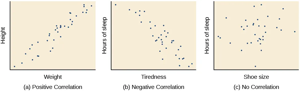
Three scatterplots illustrating positive correlation, negative correlation, and no correlation. The points are plotted using paired scores on the x- and y-axes, making it easy to see both the direction and the strength (tightness) of the relationship. Source
Scattergrams
A scattergram is used when a researcher has two sets of numerical scores and wants to display how those scores are paired.
Scattergram: A graph that plots paired numerical scores as points to show the pattern of a relationship between two measured variables.
Each participant or observation contributes one point on the graph. One set of scores is placed on the horizontal axis and the other on the vertical axis. The overall pattern of the points can show whether scores tend to rise together, fall as the other rises, or show no clear pattern.
Scattergrams are useful because they display:
the direction of a relationship
the apparent strength of the pattern
unusual scores that stand away from the rest of the points
They are not appropriate for displaying simple category totals. Their purpose is to show paired numerical data visually.
Bar charts
A bar chart is suitable when quantitative values are being compared across separate categories or groups.
Bar chart: A graph that uses separate bars to show and compare numerical values for distinct categories.
In a bar chart, the bars are separated by gaps because each category is distinct.
The height or length of each bar represents the size of the value, such as a frequency, percentage, or mean. The horizontal axis usually shows the categories, and the vertical axis shows the numerical scale.
Bar charts are useful because they:
make category comparisons quick and clear
are easy to read visually
work well when the categories are separate and non-continuous
To present data accurately, the bars should usually be the same width and the scale should increase evenly. If the scale is inconsistent, small differences can appear much larger than they really are.
Histograms
A histogram is used for continuous quantitative data that have been grouped into intervals.
Histogram: A graph that uses touching bars to show the distribution of continuous numerical data across score intervals.
Unlike a bar chart, a histogram has no gaps between the bars because the score intervals are continuous.
The horizontal axis shows the intervals, and the vertical axis shows how much data fall within each interval, usually as frequency.
Histograms are helpful because they show:
how scores are distributed across the range
where scores cluster
whether the spread is narrow or wide
the overall shape of the distribution
At A-Level, the important distinction is that a histogram is for continuous grouped data, while a bar chart is for separate categories. Confusing these two displays is a very common mistake.
Choosing the right display
The choice of display depends on what the researcher wants the reader to see.
Use a table when exact values are important.
Use a scattergram when showing paired scores and the pattern between them.
Use a bar chart when comparing distinct categories or groups.
Use a histogram when presenting grouped continuous data.
The best display is the one that communicates the data most clearly without adding unnecessary complexity.
Common presentation errors
Some mistakes reduce clarity or lead to inaccurate interpretation:
missing titles or axis labels
leaving out units
using uneven or cramped scales
plotting too much information on one display
putting gaps in a histogram
making the bars touch in a bar chart
choosing a display that does not match the data type
Psychology students should aim to present data so that another person can understand the results quickly, accurately, and without needing extra explanation.
Practice Questions
State two features of a histogram. (2 marks)
1 mark for stating that the bars touch.
1 mark for stating that it is used for continuous quantitative data grouped into intervals.
Credit other accurate points such as:
the horizontal axis shows score intervals
the vertical axis usually shows frequency
A psychologist has collected two numerical scores from each participant and wants to present the data visually. Explain which display should be used and outline how it should be presented clearly. (6 marks)
1 mark for identifying a scattergram.
1 mark for stating that paired scores are plotted.
1 mark for stating that one score is placed on the horizontal axis and the other on the vertical axis.
1 mark for stating that each participant contributes one plotted point.
1 mark for stating that the graph should have a clear title.
1 mark for stating that the axes should be clearly labeled and/or use a sensible scale.
FAQ
The appearance of a histogram depends partly on how wide the intervals are.
Wider intervals can hide detail and make the distribution look smoother.
Narrower intervals can show more variation but may make the graph look more uneven.
This means researchers should choose intervals carefully so the display is clear without being misleading.
Overlapping points happen when multiple participants have the same paired scores.
You can:
make a note that overlap occurs
use a slightly larger symbol count in software if available
report the issue alongside the graph if it affects clarity
The main aim is to avoid giving the false impression that fewer cases were recorded than actually were.
Yes, but the choice still depends on the type of data.
A bar chart can show percentages for separate categories.
A histogram can show percentages only if the data are still continuous and grouped into intervals.
The key rule is that the graph type must match the structure of the data, not just the numerical format.
Not always, but the choice must not exaggerate the pattern.
For bar charts, starting at zero is usually best because bar height represents amount directly.
For scattergrams, axes do not always have to start at zero if the scale remains fair and clear.
For histograms, the frequency axis usually starts at zero.
If an axis is cut off, it should not make small differences look dramatic.
Yes, if both formats serve a purpose.
A table gives exact values, while a graph gives a quick visual impression. Using both can be helpful when readers need precision and clarity.
However, repeating the same information is only worthwhile if it improves understanding. If one display already communicates the data clearly, adding another may be unnecessary.
